I love this time of year! Not only is it my birthday week and month it’s also March Madness!
This may be somewhat surprising for those who don’t know me personally, but I love me some college basketball. I played as a kid and through high school. And despite not being all that good, I still have love for the sport. My dad used to take me to the tournament when they held games in Los Angeles. Now my husband and I try to go to at least one round whenever it’s hosted here in Charlotte.
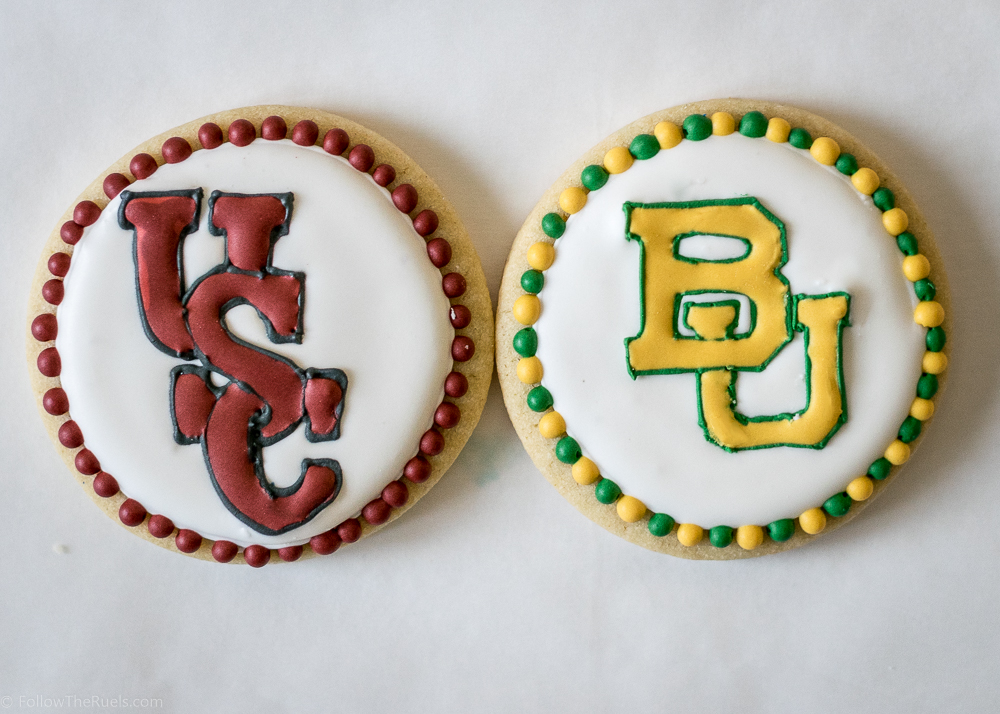
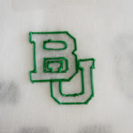
This year I am particularly excited because my team (the Baylor Bears) have advanced to the Sweet 16. Not only that, but they are playing South Carolina in the Sweet 16 game, where a lot of our friends went to school. To mark the occasion, I thought it would be fun to make some cookies with the Baylor and USC logos.(That’s University of South Carolina for those of you out West. It has taken a long time for me to think of USC as South Carolina and not Southern Cal.)
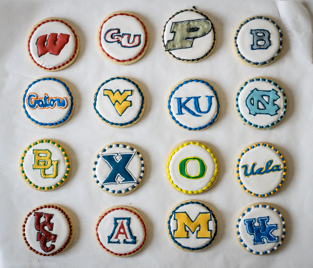
But why stop there? There are 14 other well deserving teams that should also get cookies, right? I know a few Tar Heel friends that would be very upset if I left them out.
So I did all 16. It was a hell of an afternoon, but it was a lot of fun. And it gives me a chance to demonstrate how you can make your very own college logo cookies! It’s actually not as hard as you may think!
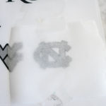
Can you trace a picture using tracing paper? Then you can trace a logo on parchment with royal icing!
First, start with a print out of your favorite team logo that’s a little smaller than your actual cookie. For reference, my cookies were about 3″ in diameter and I printed out my logos to be 1.5″ to 2″ inches at their widest/tallest (with the exception of Purdue’s P, which is much wider than I expected).
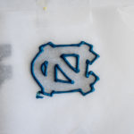
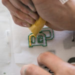
Cover the logo with a small piece of parchment, then outline the logo in piping consistency royal icing and fill in with flood consistency and use a toothpick to spread out the flood icing to fill in all the corners.
This particular logo (and most logos) has a contrasting border, so I almost always use piping consistency for the border and flood for the interior. If it is a large single color logo (see Wisconsin’s W), I used red flood for the entire thing, but it was harder to get the detail in the W. For thinner logos (Kansas), I used piping consistency for the whole letter.
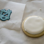
Transfer the parchment with the logo to a flat counter or board and tape down all the sides. Parchment has a tendency to “roll” which will cause your logo to be misshapen, so that it won’t lay flat on the cookie.
Allow the logo to dry for at least 2 hours. You will know the logo is ready when it easily slides off the parchment. If you are met with any resistance when peeling off your logo….continue at your own risk!
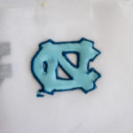
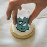
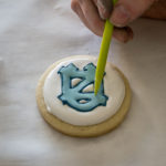
Getting your logo onto the cookie is the easy part! When you know your logo is dry, outline and fill your cookie. Immediately drop the logo (or royal icing transfer) onto the wet icing. Use a toothpick, scribe tool, or your finger to press the logo down into the icing. If you have any gaps, you can pipe in some additional icing to fill them in.
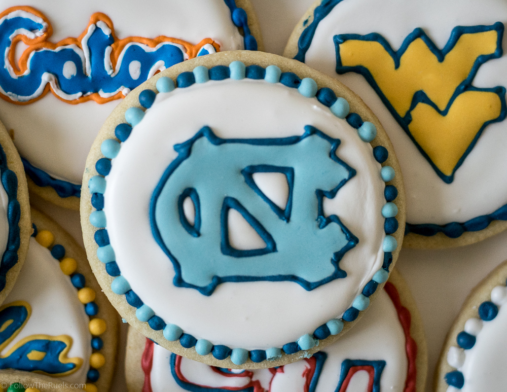
Once your cookies are dry (or dry-ish), you can go back in and add a border! My favorite is to just pipe dots around the side. Just make sure to pipe ever other dot if you are using flood consistency icing. They will run together if you pipe two dots right next to one another without letting one crust over (about 5 minutes) in between.
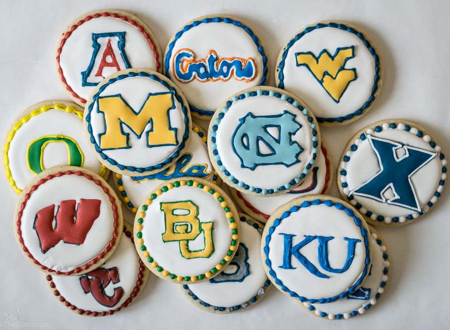
As much fun as these cookies were, some of these logos were a pain in the butt. About 10 cookies in, I was creating a bracket in my head with which cookies would advance based on how much I liked making their logo. Ranked from 1 to 16 they are….
- Michigan. Straight edges and a nice big solid color was basically everything I could ask for in a logo.
- West Virginia. Samezies ^^
- North Carolina. It’s just a fun logo with pretty colors.
- Oregon. You would think with it being so easy that I would have done a better job.
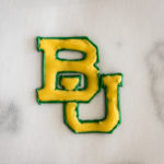
- Baylor. Interlocking letters is challenging, but I am ranking this higher because I am biased.
- Xavier. It’s a little uppity with it’s 3 color logo (you can’t see one of the colors).
- Wisconsin. It looks like it should be simple, but my brain had trouble with the drop shadow.
- Kansas. Simple, but also super delicate. I was afraid I was going to break it!
- UCLA. This one was tricky, but I was proud of myself for getting something that resembled the letters ‘U’, ‘C’, ‘L’, and ‘A’.
- Arizona. Three colors is one color too many.
- Kentucky. This one was only two colors, but it acts like a three color logo, and you already know how I feel about those.
- Purdue. I didn’t like the colors and the logo came out too big. None of this is Purdue’s fault. The actual logo was pretty easy to make.
- South Carolina. Interlocking three letters?! Ugh, might as well have three colors while your at it.
- Florida. It’s like the UCLA logo, but with two more letters, which really just made it impossible for me.
- Gonzaga. I had to alter their normal logo, because there was no way in hell I was going to try to pipe a tiny bull dog.
- Butler. I had to MAKE UP a logo for them because their only logo is a freaking bull dog. What is it with bull dogs? Why do they have to be a part of your logo!?
Just kidding, I love bull dogs (all dogs, really), but I did not want to attempt to make one with royal icing.
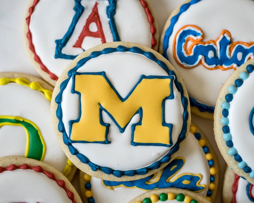
So as far as I am concerned, Michigan is the real winner this March Madness. I know at least one Wolverine who will be happy about that! Go Blue!
(…and go Bears!)
